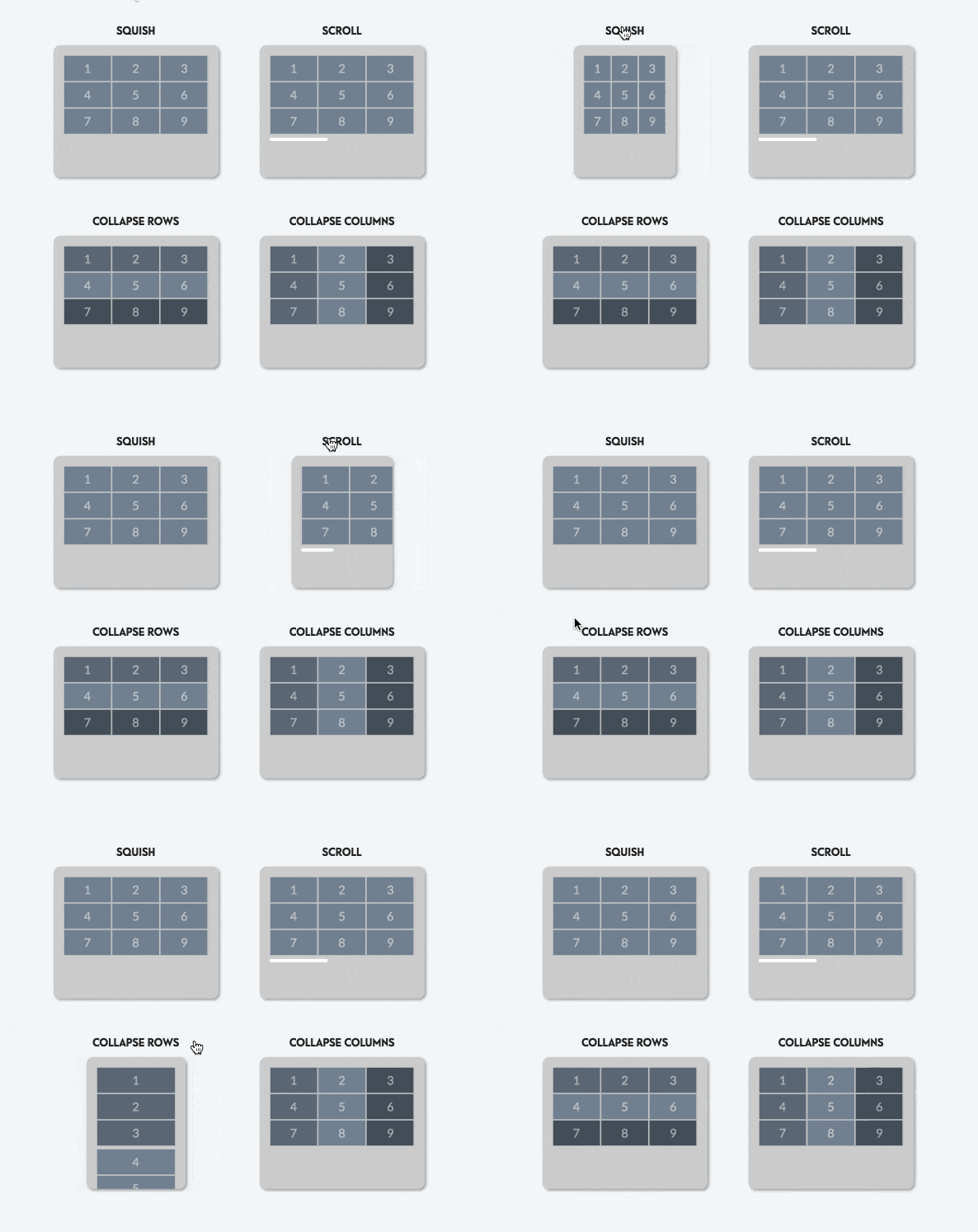
The table is the most common component we using day by day in web applications, but when working on the mobile version, the UX seems really poor for users.
In search of a way to resolve it, I found there are 4 interesting solution

Let's walk through 4 solutions
- Squish - Look like the default one Browser provides us, and it a worse. What if I have 10 columns right there ?!?!
- Scroll - Hey, look better than the
Squishone, your 10 columns should be displayed fine. But the horizontal scroll seems not good for mobile use - Collapsed rows - This looks great, we turn complex tables into sets of cards, 10 columns is not a problem so far
- Collapsed columns - For me, I don't know any use case we need that. Do you guys have any idea? comment bellow 👇
How to turn a table into cards on mobile view?
Step 1: Hide the header
I'm using TailwindCSS so the code should be
<thead className="hidden bg-gray-50 lg:table-header-group">
Step 2: Make all td display as block
<td className="block lg:table-cell">
Step 3 (Optional): Show column name for each section When turning rows into cards, it's hard for users to know which section of this card belongs to, so we should better show the section name
Add data for cell
<td data-label="Bio" className="px-6 py-4 cell-responsive">Use CSS to display the metadata
.cell-responsive::before {
content: attr(data-label);
@apply block text-sm font-normal text-gray-500 uppercase lg:hidden;
}
Result

